The audience of "Amped" would be young individuals with the age ranging from 13-20 who love Indie music and Rock.
I would also aim my magazine to introduce new and upcoming artists, for instance Vagabond who I have done my double page spread about and I basically based the magazine on them. This would help give them become more well known and give them more of a boost into the music industry. This would incourage my audience to also not listen to just artists in the charts but bands that are not well known and are less successful as they still have talent and this would give these less establised artists a boost as they are popluar.
My magazine does conform to magazine conventions with the barcode and price information being included. The text is layed out similarly to other music magazines as it involves a large title at the top of the front cover with the images having a higher proportion of image to text. The magazine does use magazine conventions so that it is recognised as a magazine and then to make my magazine look like a music magazine my photography on the front cover involves the lead singer of Vagabond singing whilst playing a guitar.
Banners are used on my front cover which are used as a promotional tool mainly for competitions and free give-aways, for example on my front cover I advertise a free HMV voucher. I chose this to encourage the reader/buyer to use this voucher and not download illegally which is a major problem in the music industry today.
The colour scheme ended up being black, white, red, blue and yellow. The black was chosen as it is quite conventional for a indie/rock magazine, the white then contrasts with this. I thought that the black and red worked against each other well and then the yellow came from the guitar which was in my picture on my front cover. On the other hand in comparison to this my preliminary task of producing a school magazine included very feminine colours as I was aiming to attract an all-girl audience as I go to an all-girl school with the ages ranging from 15-18 (GCSE level and A Level)
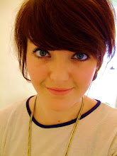
The background image on my front cover is very different and I think unique as Vagabond are not a well establised band and therefore the lead singer who I used on my front cover is not very well known. This will attract people that are looking for new music as some may not recognise him. Even though I focused on one band for my photo on the front cover I used a range of artists as to cover a wider audience, with artists like, Kings of Leon, Florence and the Machine, James Morrison, The King Blues and Vagabond.
I believe I have learnt more about technologies by completing this coursework as I had very little knowledge previously on how to use Photoshop to edit my images but I now feel more confident when using this programme. Additionally I had never made my own blog before and at first found it quite difficult to set it all up and start writing, but once I started I soon got the hang of it and actually found it quite rewarding.
Since the preliminary task I feel I have become a lot more confident especially with the use of technology, the construction of media products and the ideologies behind music magazines.
Finally I think my music magazine would best suit being distributed by a conglomerate as if it was a smaller company then it would struggle to get the magazine in shops, whereas a larger company would have contacts and know more people within the industry to help with production.
No comments:
Post a Comment